PROJECT SCOPE
BRANDING | GRAPHIC DESIGN
RUN PURE POKER
OVERVIEW
Run Pure Poker is a Sydney-based poker entertainment company that partners with venues to deliver professionally run cash games and tournaments. The brand focuses on strong venue partnerships, player engagement, and premium in-venue experiences.
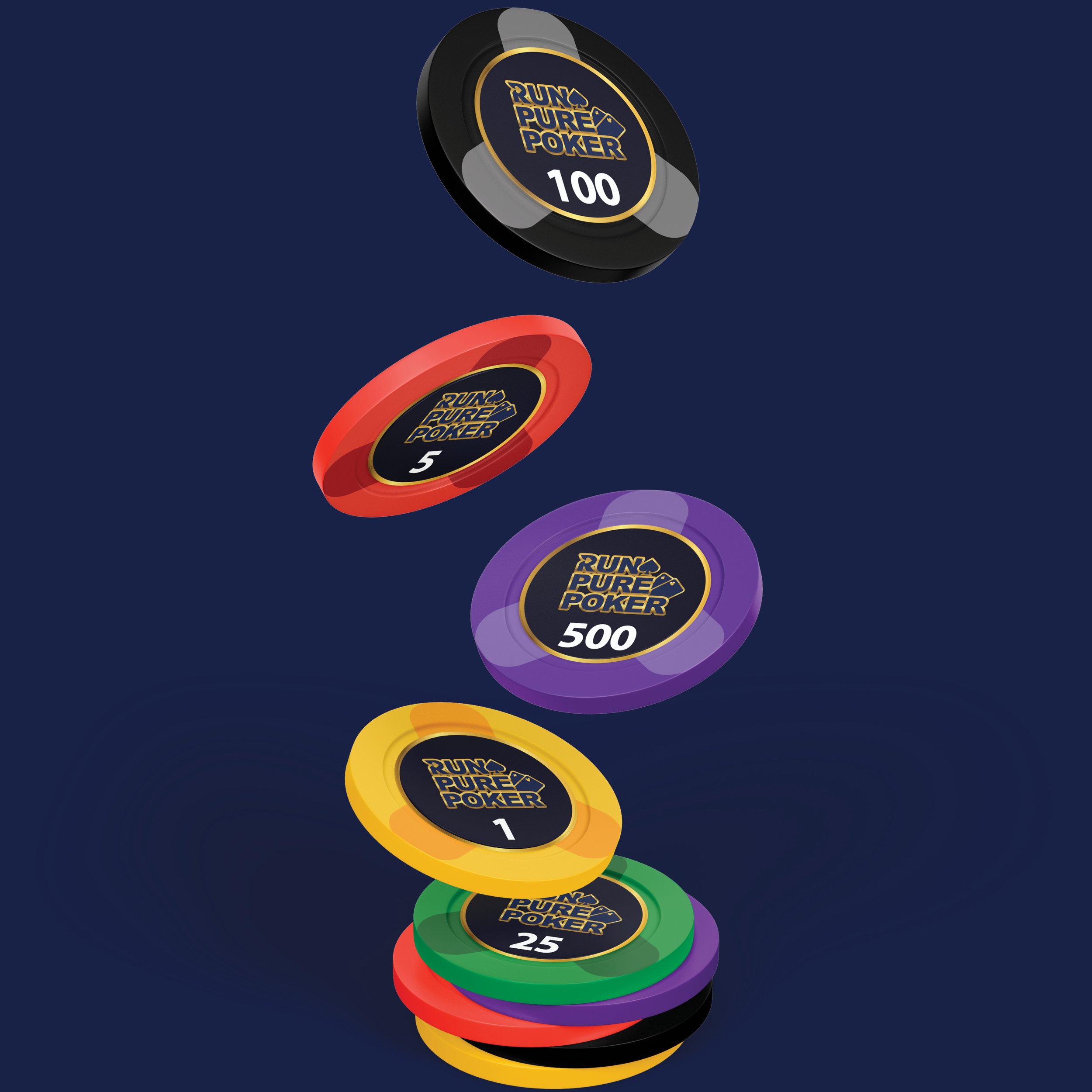
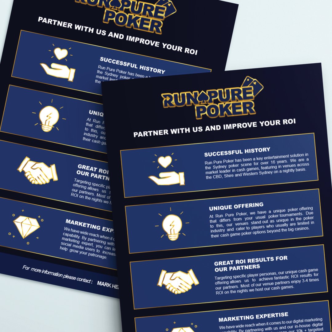
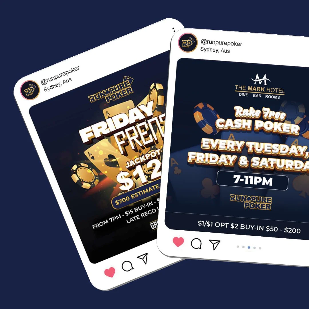
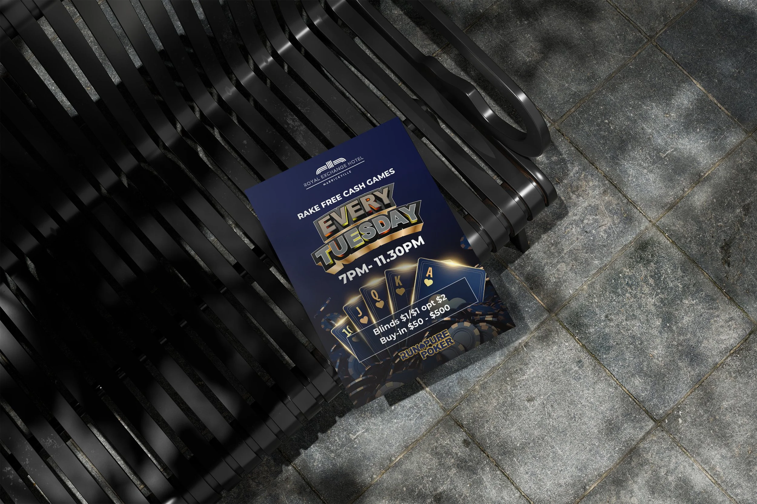
I developed the brand identity and visual direction, designing the logo, campaign collateral, poker chip visuals, and a suite of promotional and social media graphics. The bold, casino-inspired aesthetic combines strong typography and dynamic layouts to create a cohesive presence across print and digital platforms.


ABOUT THE LOGO
The Run Pure Poker logo was designed to reflect the premium, high-stakes nature of the poker industry. Bold, custom-styled typography creates a strong and confident presence, while the gold gradient detailing conveys prestige and reward. The deep navy base adds professionalism and contrast, allowing the mark to feel both dynamic and authoritative.
Subtle poker elements, including the spade icon and playing cards, reinforce the brand’s identity without overpowering the design. The logo system includes stacked, horizontal, and standalone variations to ensure versatility across print and digital platforms.